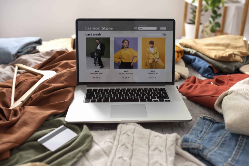
The Two Most Important Factors In Ecommerce Design Free Advice 2023
The Two Most Important Factors In Ecommerce Design Free Advice 2023 – OK, so the title isn’t strictly true there is one important factor in ecommerce shopping cart design and two things you have to do achieve it. The goal is to make people purchase your product. The two things you have to do to make them buy is to help and persuade.
When you design a site you need to pay serious attention to it’s usability and it’s persuasive abilities. The aim of a good eCommerce solutions is to gently (or not so gently) persuade the sites user to purchase the product they want to make sure that they find this as easy as possible you need to make sure that your website is as usable as possible. There are thousands of usability and persuasive design methodologies and we don’t intend to cover them all in this article. We have identified a couple of the most important factors in both areas and given you some tips and guidance to help you tailor your shopping cart software to increase sales.
Usability Design
When a customer lands on your internet store they will only have a certain amount of patience, once this all runs out they will give up and leave your site for one of your competitors. The easier your site is to use and the less they have to think about how it works the longer they will stay on your site, and the more likely they will be to purchase from you.
With the increase in the use of CSS and the increasing accessibility of graphic manipulation packages people are able to completely customise the way the ‘things you click’ on their web-site look, the limit it pretty much their own imagination. Unfortunately this can lead to some confusion for users who have to think about what is clickable and what isn’t, this will cause them to get frustrated.
With text links it’s best to follow HTML tradition, keeping links in a contrasting colours and keep them underlined. Users also like to know where they have been, so keeping links that have been visited in another colour is good practice.
The best course of actions with buttons is to … well… make them look like buttons. I know it seems patronising but a lot of people forget this when they’ve spent a lot of time making sure the buttons on their site fit in with the design. Raised looking buttons are difficult to make look nice and clean without them looking a little ‘2001′ but it’s really worth spending a little time thinking about your buttons.
One of the easiest way to lose customers is to actually lose them. If you customers can’t find their way around your store, or can’t find their way to wherever they want to be they’re not going to buy from you.
What’s the best way to achieve this? Well it’s probably by using tabs. they give a good idea of where the user is, and how they can get to where they want to be.
Tag Lines are frequently dismissed from modern website design in order to make at design look less cluttered, and certainly there are situation where removing a tag line will do no harm but generally there are useful. It is important that a customer know as quickly as possible if your site will sell the product they are looking for. A good example of this is Amazon when they first launched they used a tag-line similar to ‘Online Bookstore’ because when customer landed on their page they would have had to think a little to work out that a company called Amazon was in fact an online book store. However as Amazon are now so well known they have removed it as it’s no longer needed.
Persuasive Design
Once you’ve addressed the Usability of your store and your visitors can find their way around your site easily and find their way to where they want to be, you must then consider the second important part of the design. You need to make then go to where YOU want them too, the order confirmation page. Below are 3 tips for making this happen.
Once the user has put some items into their cart and clicked on the checkout button there is a good chance that they really want to buy something. So whatever you do make it as easy as possible for them to put their credit card details in and click the order confirm button.
A design practice that we implement is removing all unnecessary links from the order process. For example all links to the ‘home’ and search boxes are removed. If the user goes searching for other products then it’s possible that they’ll get side tracked and forget that they were going to buy your products. But make sure that the user still has access to the information about the product that they’re buying, we try to implement this by including all the information on the shopping cart page, or by linking to pop-up with the info in, we don’t link back to the original product page as this could lead to further distractions.
Long checkout processes with multiple pages is also something that should be avoided. Only ask the customer for information that you really need.
One of the main ways that people will look for products on your site is by using the search box. Rigging (or Mapping) your searches will allows you to map products to keyword, so when a customer searches for a word related to a product that does not include the keywords in the title or the product text you can make sure the products show up. This is just like a customer asking a shop assistance for a product when they know what they want the product to do, but are just not sure of the name of the product.
You need to make your product descriptions and products images as descriptive as possible, don’t ever assume that your customers are as well versed on your products as you are. If there is something they want to know and you haven’t covered they will do one of three things:
? Ask you, which happens a lot less than you would imagine.
? Go and look on a competitors web-site, if they have the information then it’s likely you’ve lost a customer.
? Give Up.
Also the more information that you include the more ’spider food’ there is got the search engines, writing the product descriptions is a good time to focus on Search Engine Optimisation.
Following a couple of these simple guidelines you should see a marked increase in the conversion rate for your store. There are also many other usability and persuasive design models that you can apply and we defiantly recommend searching for some more to apply to your shopping cart.
Blog : Click Here
Sitemap : Click Here
The Two Most Important Factors In Ecommerce Design Free Advice 2023 – The Two Most Important Factors In Ecommerce Design Free Advice 2023 – The Two Most Important Factors In Ecommerce Design Free Advice 2023 – The Two Most Important Factors In Ecommerce Design Free Advice 2023 – The Two Most Important Factors In Ecommerce Design Free Advice 2023 – The Two Most Important Factors In Ecommerce Design Free Advice 2023 – The Two Most Important Factors In Ecommerce Design Free Advice 2023 – The Two Most Important Factors In Ecommerce Design Free Advice 2023 – The Two Most Important Factors In Ecommerce Design Free Advice 2023 – The Two Most Important Factors In Ecommerce Design Free Advice 2023 – The Two Most Important Factors In Ecommerce Design Free Advice 2023 – The Two Most Important Factors In Ecommerce Design Free Advice 2023 –


